The Basic Website Mistakes and the Quick Fixes
Getting started with a website for your small creative business (read artist website) is usually a bigger project than it is expected to be. This is mainly because there’s so much to learn in the process. So it is very easy for some of the finer details to get past.
When I add new members to the What’s On directory pages I always test the links that I’ve been sent and added to their listing. I need to know that the links are working properly and it is a wonderful opportunity to learn more about what my new members are doing.
I am noticing some consistent website design challenges with quite a few of the sites, namely with the social media links and the navigation bars. So I thought it would be really helpful to share some quick fixes here for you as part of the skills sharing series of stories.
Social Media Icons
Making it really easy for people who come to your website to pop over to your socials and follow you there is vital.
We all want to grow our audience, our following of potential customers and supporters.
The three places where it is important to have your social media profiles linked from are:
- Top navigation bar – this is the section that goes across the top of your site that has the menu label links for your site, your logo and site name in the left corner and the linked icons for your socials in the top right corner.
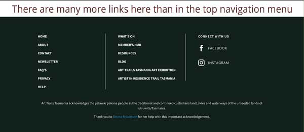
- Bottom (footer) navigation bar – this is the section at the bottom of your website that has loads of links to pages through the website, your copyright and acknowledgement statements.
- Contact page – where people can send you an email and connect with you.
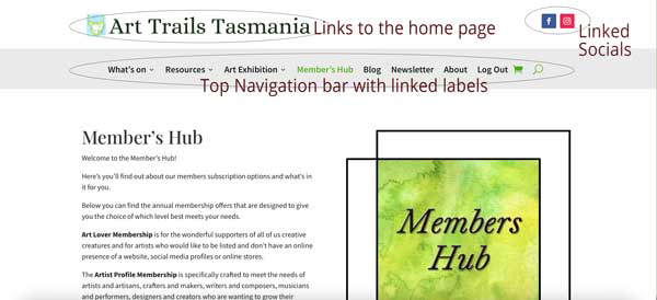
Having your Social Media Icons in Both the Top and Bottom Navigation Bars
The key reason it is so important to have your social media profiles linked from both your top and bottom navigation menus (bars) is to make it really easily for your visitors to find you on the socials so they can follow you there.
Don’t make folk go hunting for your linked social media icons. Most won’t put the effort in and you’ll lose that potential follower.
It takes a lot of work to build up your followers so do the basic things properly and allow it to flow better for you.
Making Sure Your Social Media Icons Link to Your Social Media Pages
One of the most surprising discoveries I’m making with the social media icons on websites is that they are linked either to the website builder’s socials or to the top of the page.
One member is using WIX for their website and their social media icons are linked to the WIX Facebook and Instagram pages. Another one is using Squarespace and is having exactly the same problem.
As a general rule, I would avoid building a website using WIX because of all the disadvantages. I use WordPress with a Divi theme and am loving its strength, flexibility and ease of use. I’ve friends who find Shopify good and their websites are easy to pick with their consistency in terms of clean and friendly design.
A few other websites are having the social media icons linked to take visitors to the top of the page. Hmmmm. I understand why WIX and Squarespace would be making the default link go to their social media pages to snaffle all of your potential followers but I don’t get this one.
Poatina Tree Gallery “In the Eye of the Beholder” Exhibition
Experience an abstract art exhibition at Poatina Tree Gallery, where creative, surprising works inspire all ages to see landscape and materials anew.
Simple Solution
Happily the solution is simple. Test where your social media icons are linking to and fix any problems.
As I do all the website build and maintenance for my site and I’m using WordPress, the solution for me is very straightforward – all I need to do is go to the icon and add the correct address for the link and make sure it is opening in a new window. This is important because I want my visitors to be able to stay or easily return to my website, rather than have Facebook and co. open up on top of my site.
If you’re working with someone else on your website be sure to send them the correct links and the instruction to have them open in a new window.
The Knack for Sending the Correct Links
The best way to make sure you are sending the correct links to your social media profiles is to copy and paste the URL website address from Facebook, Instagram etc.
When you go to type out the social media website address it can be very easy to make a typo mistake. If you’re paying for the update then you’ll have to pay a second or third time until your website developer gets the correct information from you.
Don’t expect someone else to do your job with accuracy. Copying and pasting the address is cheaper for you.
Setting Up Your Own Vanity Username on Facebook
This one is quite important and it is straight forward to do.
A vanity username on Facebook is simply about having your name as part of the website address, eg. https://www.facebook.com/arttrailstasmania/ is my vanity username for Art Trails Tasmania on Facebook.
It makes it really easy for people to tag my page, type it in and quickly orientate themselves.
This is instead of a bundle of random numbers that Facebook initially assigns to a page. Happily it takes only moments to fix.
Here is an article by Hubspot on how to do it: 3 Easy Steps to Create Your Facebook Vanity URL [+ Tips]
More Information About Linking Your Socials
Whenever I need to learn more about how to make something work on the website I google it. While it can be difficult at times to know who to trust online, over the years I’ve tended to trust Hubspot articles.
Here’s one on How to Create Social Media Buttons for All the Top Social Networks that I hope you find helpful.
It is quite easy to get lost down the Hubspot rabbit warren of articles and think yourself into overwhelm.
I’ve learnt to just accept that they will have a heap of articles for the full on internet marketing folk as well as a bundle of ones that are great for getting the basics right. I tend to stick with the basics.
Telling Our Members’ Stories in the Blog
Have your sent in your Artist profile story yet? All Artist Profile and Artists Ensemble members get to share their stories here via our blog and socials.
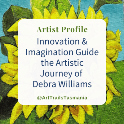
Innovation and Imagination Guide the Artistic Journey of Debra Williams
Be inspired by the artistic journey of Debra Williams as she challenges her own creative growth and finds joy through out.
Top Navigation Bar Features
The logo and business/site name should always link back to the home page as this is a standard that the vast majority of visitors are use to.
Be careful about how many items/labels you have in the top negation bar because too many will be confusing and messy.
If you look at the Art Trails Tasmania top navigation bar you’ll see that I’ve nested menu items, mainly for the What’s On directory, Resources, Art Exhibition and About. Whereas this doesn’t happen in the bottom navigation menu.
More
I’ve started seeing some top navigation menus with the label More that has nested items such as Home, Contact etc. I’m not convinced that this is good website design.
If you’re going to nest under a label then the grouping needs to be really thought through. Say for example, you could have under the About label, Contact, FAQ’s, Meet the Team, Home.
Don’t Lead with Home
There’s no need for the label Home to take pride of place (or arguably any place) in the top navigation menu, especially with the logo and site name being linked to the home page. It can take poll position in the bottom navigation menu.
The Art of A Good Top Navigation Bar
There is quite an art to a well designed top navigation bar, and especially so when it is seamless. It is meant to be logical for your audience and answer their questions easily.
The key to this is knowing your audience and grouping the content well for them.
The Bottom Navigation Bar
The bottom (footer) navigation bar is where you can go to town and have loads of linked labels. These can be in three or four columns that have up to 10 layers. Do try to make these columns even in the number of labels/items.
Some of the linked labels could be to your Privacy statement, Help, FAQ’s as well as your key information links (for this site that includes What’s On, Blog, Resources etc).
Knowing Who the Menu Labels are For
When you’re coming up with the names for the labels think about who they are for, ie. your website visitors. For example, Art Trails Tasmania has two key audiences; our artists and our supporters, those who will hopefully become your customers.
Looking After Your Audience
So the What’s On menu label is mainly for our supporters, so they can find our members and head over to their websites and socials.
The Resources and Art Exhibition menu labels are mainly for our artists, but is also intended to be of interest and value for our supporters.
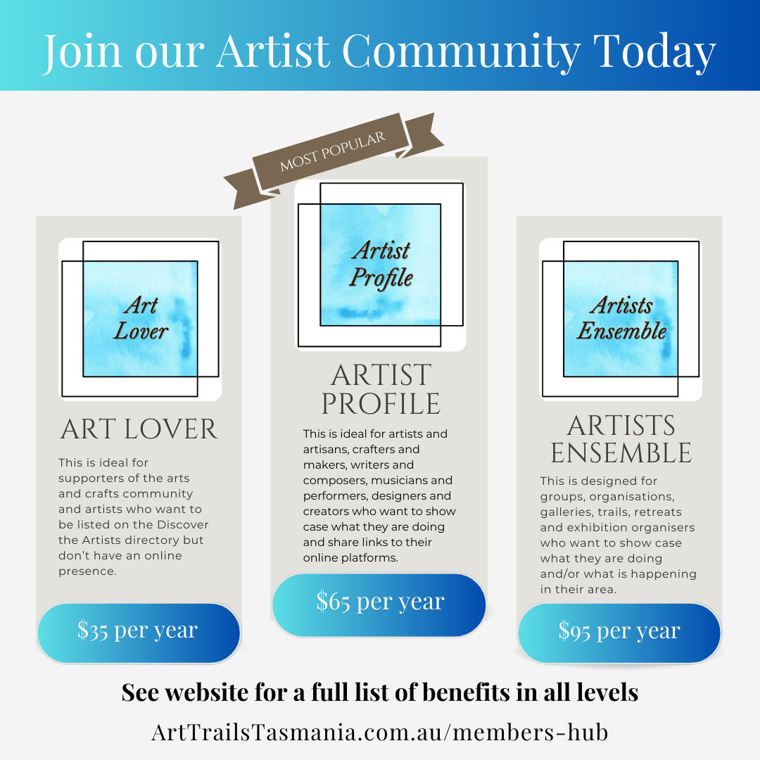
Our Member’s Hub is for our artists and supporters to join our community. With the Log In menu label is for our members.
While the Blog, being the home for our Profile and Event stories, our skills sharing stories and update news is for all of our audiences, is for all of our audiences.
As too are the Newsletter and the About labels.
Down in the Footer (Bottom) navigation bar there are additional navigation labels, such a Contact, Help, Privacy and Home.
Keeping Your Menu Label Name the Same as Your Linked Page Name
Just as Facebook rewards the pages and groups who have their posts shared, liked and commented on (in both the original page it is shared from AND the page it is shared on), so too does Google have rewards for how things are done.
It is important to have the same name in your menu label as on your page name.
For example, our Blog menu label is the same as the page name (URL) https://arttrailstasmania.com.au/blog/
Note how it is the same, not different like Blog linked to www.arttrailstasmania.com.au/arttrailstasmaniablog
The Google Gods
You get rewarded by the Google gods for having the same name. Given how capricious the Google gods can be for us micro – small creative business owners, changing algorithm goal posts nearly as much as Facebook and co. do, it is important to nail the basics.
Generally the terms for making Google happy are SEO, search engine optimisation.
I’ll put together another post on getting the basics sorted as there is a lot to it.
Skills Sharing Stories
I want there to be more arts and crafts in our world, in our communities and in our own lives. Hopefully you’ve found this blog post useful and interesting in your creative journey.
So I’m creating, with your help, Art Trails Tasmania, allowing all of us who feel this love to create more of it.
And the Art Trails Tasmania blog is a key part of making this happen, telling the stories of members. It’s about what they have happening with workshops and classes, exhibitions, open studio trails, where to find their outlets, markets, fairs and festivals so you can shop their creations as well as their art and craft retreats.
Also being shared are the supporters of our artists, the galleries, shops, cafes, art societies and groups, places to stay and artist in residencies.
Skills Sharing Stories
15 Ways to Make Patreon Work for Artists
Here are 15 practical tips for how to make Patreon work for artisans to create a sustainable online income by Art Trails Tasmania.
7 Ways a Grassroots Artist Group Can Fundraise
This skills sharing story is all about helping grassroots artist groups and societies fundraise for a sustainable future.
Empowering Artists: Unleashing Creative Potential Through Print On Demand Stores
Discover the boundless potential of creative expression with print-on-demand stores in our latest blog post. Explore how artists are empowered to showcase their talents and reach a global audience through these innovative platforms. Unleash your artistic vision and transform it into reality today!
Artist and Writer Profile Stories
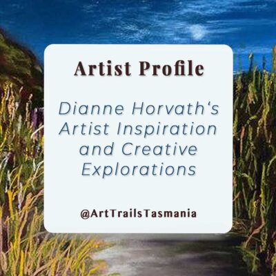
Dianne Horvath’s Artist Inspiration and Creative Explorations
Come meet pastel artist Dianne Horvath on her journey of finding inspiration in Tasmanian landscapes in her Artist Profile with Art Trails Tasmania.
The Joy of Life Through the Lens of Art with Christie Lange
Meet Christie Lange as she explores the intricate dance of art and science, unraveling the wonders of small organisms and their habitats in her Artist Profile with Art Trails Tasmania
Discover Steve Myer: Painting the Ocean’s Dynamic Majesty
Meet Steve Myer, Tasmanian artist, as he embraces challenges in painting seascapes & is inspired by the dynamic nature of the ocean in his Artist Profile story with Art Trails Tasmania

